Abstraction: is what we consider to be different or out of the ordinary towards the way we view things especially in life
The Formal Elements
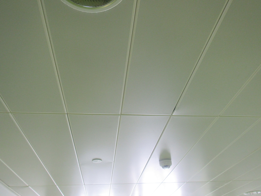
Photographers are usually aware of the ways in which they can create interest in their images beyond the simple fact of the subject. This is what separates good pictures and bad pictures of the same thing. The following list describes some of the abstract elements in any photograph. Below the list is an example of how you can analyse a photograph looking for these things specifically and how this helps to give the image meaning:
|
Focus:
Light: Line: Repetition: Shape: Space: Texture: Value/Tone: |
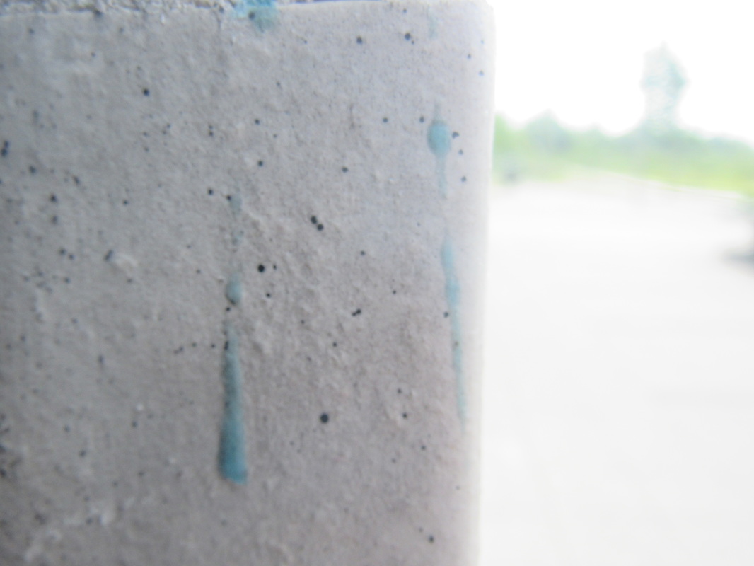
Which areas appear clearest or sharpest in the photograph? Which do not?
Which areas of the photograph are brightest? Are there any shadows? Does the photograph allow you to guess the time of day? Is the light natural or artificial? Harsh or soft? Reflected or direct? Are there objects in the photograph that act as lines? Are they straight, curvy, thin, thick? Do the lines create direction in the photograph? Do they outline? Do the lines show movement or energy? Are there any objects, shapes or lines which repeat and create a pattern? Do you see geometric (straight edged) or organic (curvy) shapes? Which are they? Is there depth to the photograph or does it seem shallow? What creates this appearance? Are there important negative (empty) spaces in addition to positive (solid) spaces? Is there depth created by spatial illusions i.e. perspective? If you could touch the surface of the photograph how would it feel? How do the objects in the picture look like they would feel? Is there a range of tones from dark to light? Where is the darkest value? Where is the lightest? |
My favourite formal element is shape because of its unique way and how its much different than all of the other formal elements.
Shape uses area and is a two dimensional space that can be seen as edges.
Shape uses area and is a two dimensional space that can be seen as edges.
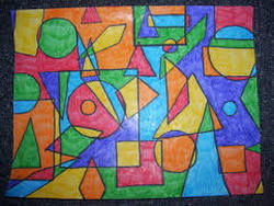
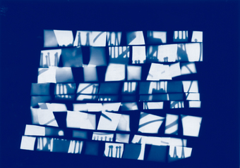
The picture here is made with shapes this is why it is good in 'shape' and this is also an abstract picture that only uses a couples of different shapes and is very good if going for the shape in formal element.
The reason I chose this image is because of its simplicity and strange look, this is a very different image and is actually a painting this is why I like so much.
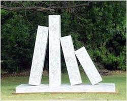
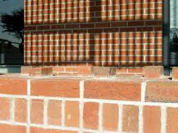
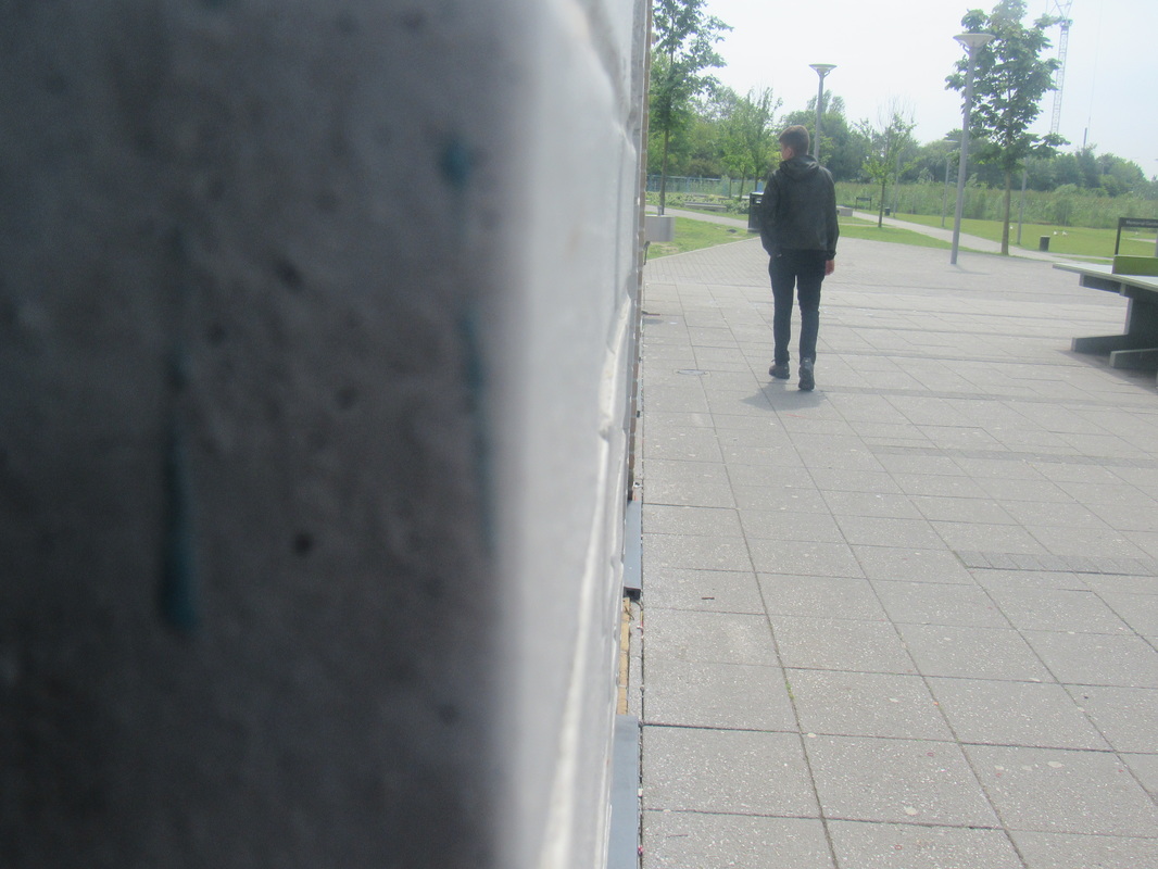
This picture is also good for 'shape' and looks abstract as well, this looks like it is made with some sort of stone, maybe some breeze block or something of a light weight. The reason I chose this image is because I think it looks good and different to most over abstract images.
Definition of 'shape'
- Shape is an area that is enclosed by a straight line, it could just be an outline or it could be shaded in.
- Shapes can be either geometric like a circle, square or triangle or irregular.
- When you draw shapes you must consider the size and position as well as the shape of the area around it . The shapes created in the space between shapes are referred to as 'negative' space.
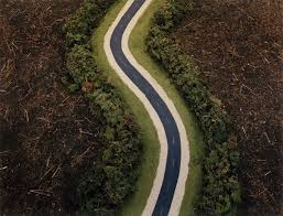
Abstract photographs
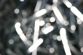
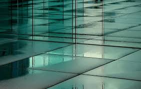
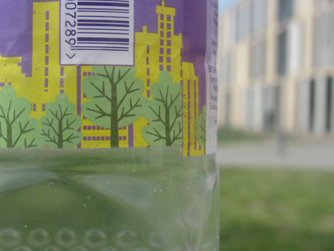
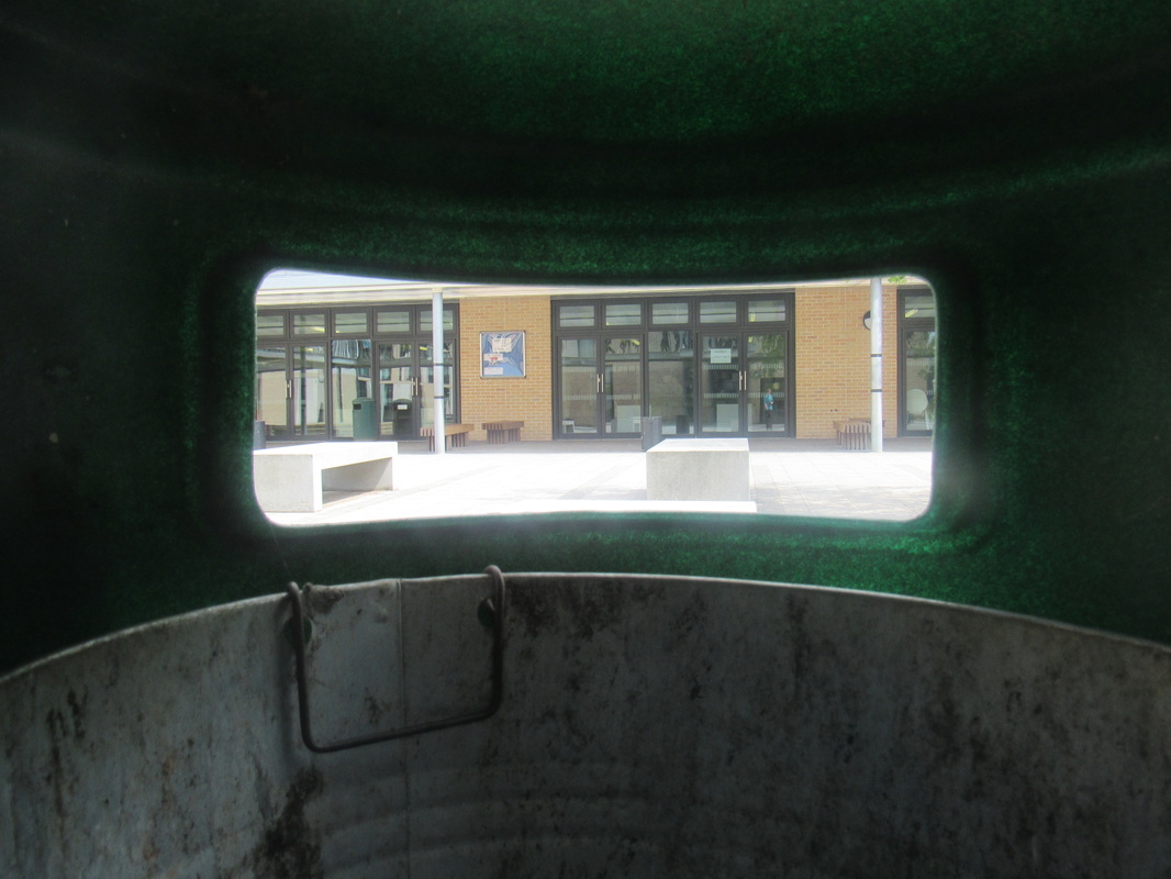
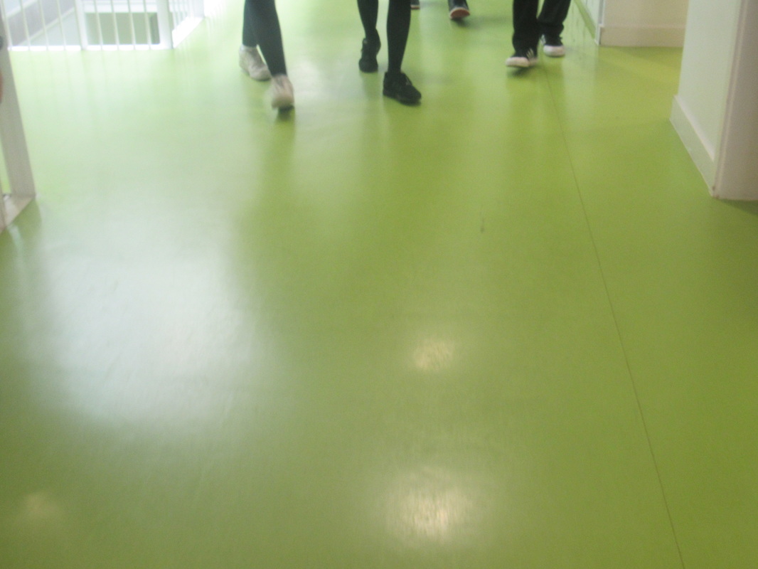
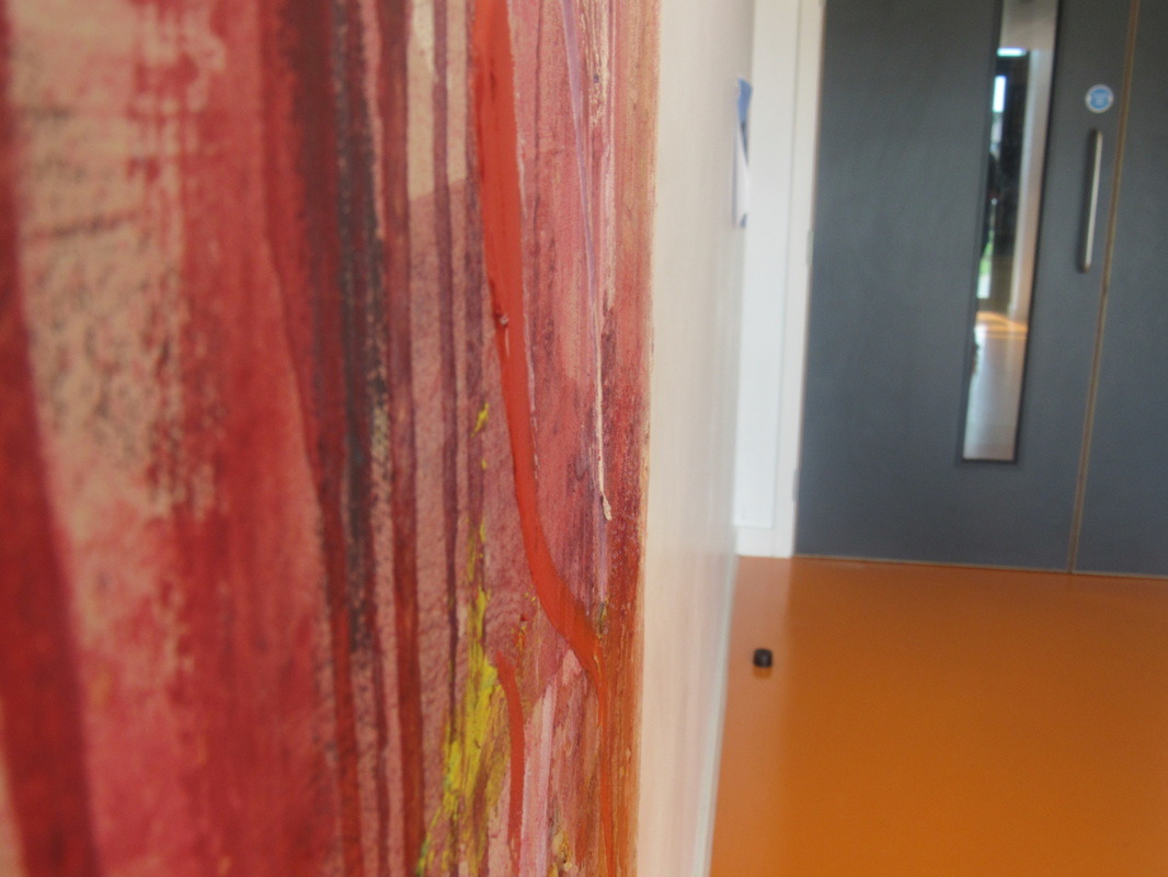
All of these images are abstract and are all very different, the reason I chose these images are because of there simplicity. You can never really make out what the images are this is why I like 'Abstract' photography so much these images I chose are my favourite i look at out of all of the one I looked at but overall my favourite has to be them middle one because it is so distinctive and opposed.
All three of these images are peculiar because you cant make out what they actually are this is because they have been made this way so it makes you think about what they could be.
All three of these images are peculiar because you cant make out what they actually are this is because they have been made this way so it makes you think about what they could be.
Mind map
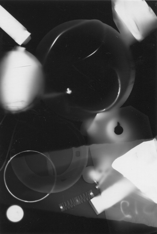
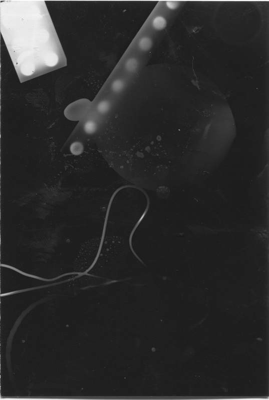
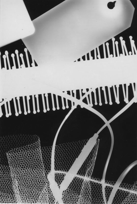
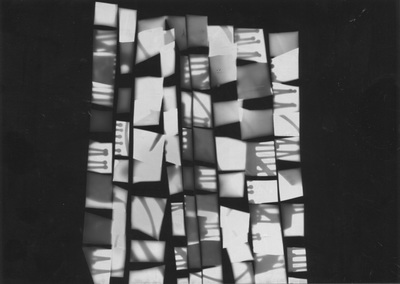
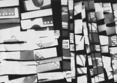
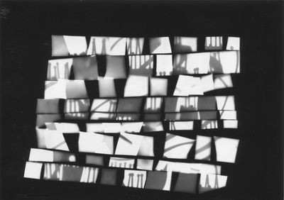
Photograms
My first set of photograms were ok but next time I would like to make them a lot bigger and use some more abstract objects and will hopefully make a lot more images than last time. But overall the images I produced were good.
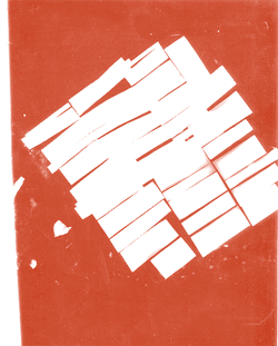
This is my duo tone i made by using photoshop by dragging the image into photoshop and then going onto 'image' then adjustment then following over to levels and you will be able to change the contrast. after you have done this go onto 'mode' then across to duo tone, then after this choose what colour you want for your image. Then the final step is to save to web devices. these duo tones can be made with all different colours and made all different shapes as well
Evaluation
My set of images I made were made by cutting up my photograms and sticking them back together with sellotape, after this I used the dark room to make a different set of photograms from my collage. My favourite image out of the collaged images is the one in the middle, because of its a mixture of two different photograms that I combined together to make a new composition.
essay
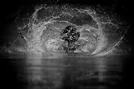
In this image i can see some sort of water fall or a tide, but also looks like a big splash of water as well. this image could of been created by someone waiting for the tide to rush in and then quickly taken a picture but there are other ways of getting images like this.
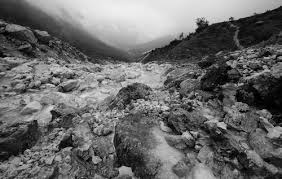
In this image i can tell that i am looking at water but cant fully tell what is fully going on. Also there are no real colours in this photo, its only really tones, black, white and grey.
Furthermore this image is much different from any other photographers images, you can make out what it is but for some reason you cant in this image i think this may of been done so that the person looking at the photo has to think about it instead of just looking at it and thinking it was a nice image this draws peoples attention to the image.
images
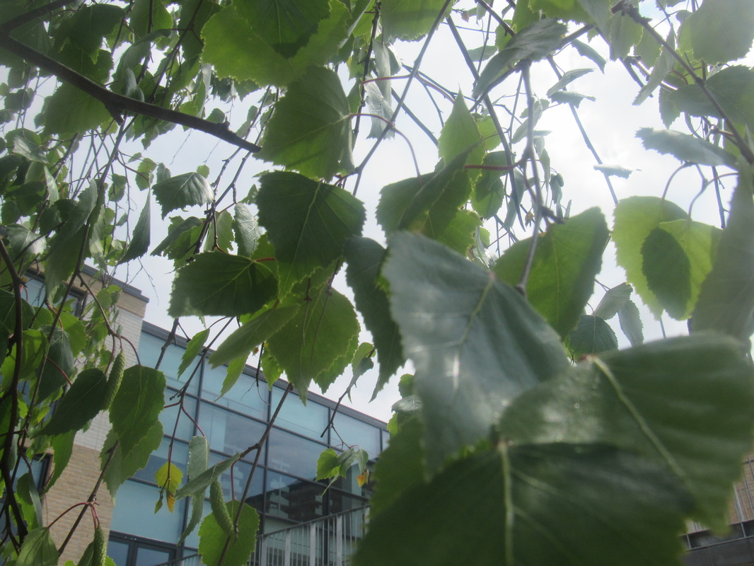
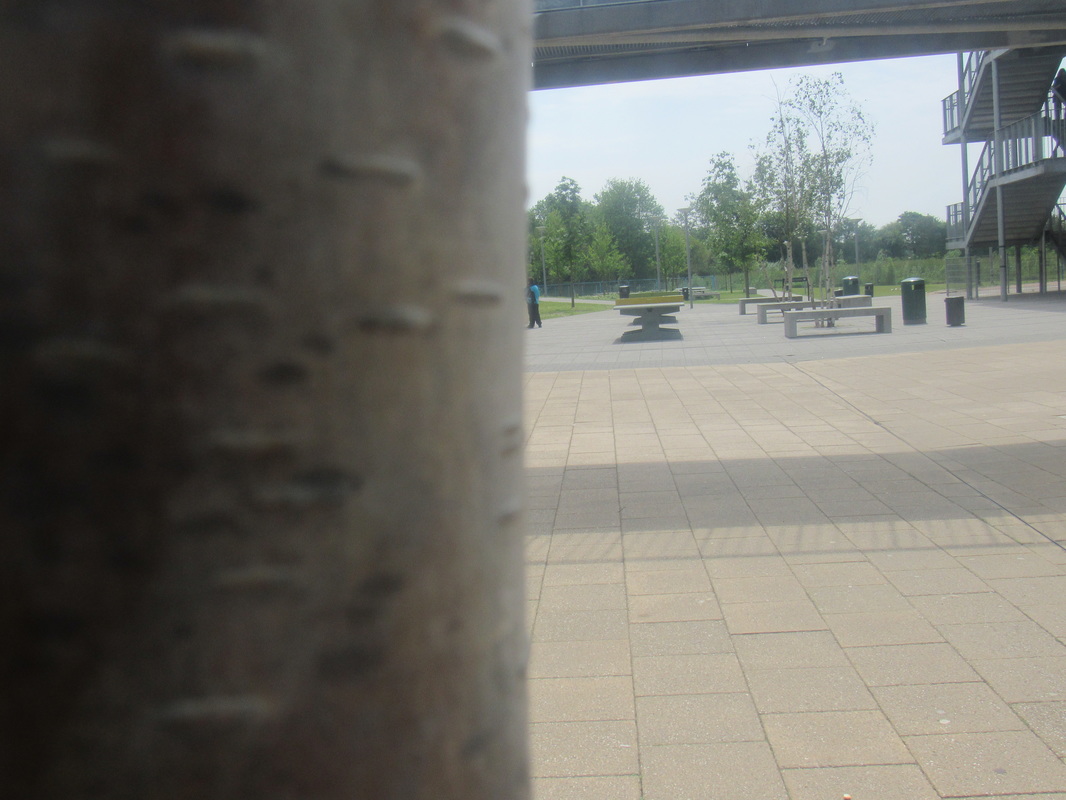
These are another set of images that i have taken using the abstraction theme, but these ones i have taken outside to get a side of nature on my page these images where mostly taken of trees and bushes every image i took made me want to expand on my photo taking skills. I would take a set of images then bring them back to the class and flick threw and looked out for the ones that really stuck out the most and these were the one that i like the most.

Saul Leiter
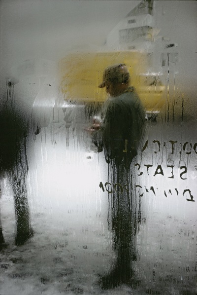

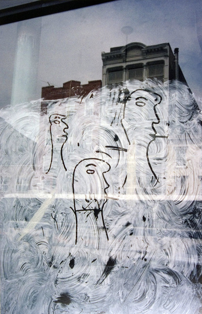
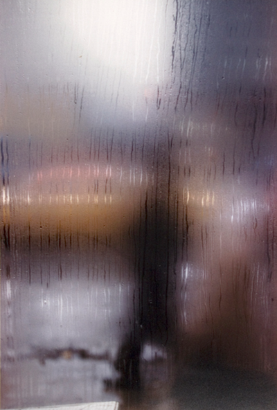
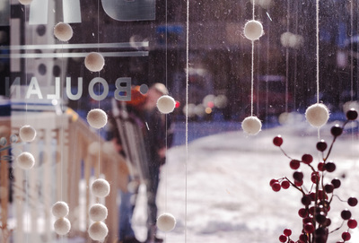
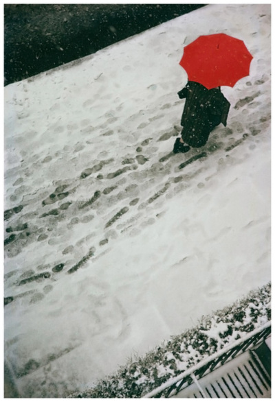
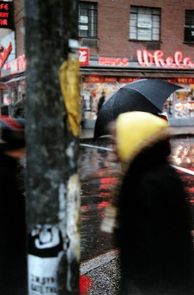

This is my favourite Saul Leiter image because for me it really stands out from all the over ones, in this image i can see some some sort of building in the background and three face that have been drawn onto the window. The image is also has a reflection in it as well some sort of building or statue, there is also another reflection of a lamp that goes up from the building at the back. The way Saul Leiter has managed to get all of these things in one picture must of been a challenge for him because trying to set it all up to capture everything would of taken time. Overall this image was the one for me that had something different from all of the other ones,
characteristics of Saul Leiters work.
The characteristic that are in Saul leiters images are things like reflection, things that you can see in the back of the image really faintly and cant really make out what they are. Other characteristic in his work are things like 'focus light' this is when the point where light rays originating from a point on the object converge. 'Texture' of the image how it looks colours and the contrasting of the image dark colours and bright colours vary in his images one minute they will be dull and gloomy and the next they will be filled with colour and brightness
